You are here
Maps and graphics of Coronoavirus outbreaks, state by state --NPR
Primary tabs
Maps and graphics of Coronoavirus outbreaks, state by state --NPR
Mon, 2021-03-01 10:02 — mike kraft How Severe Is Your State's Coronavirus Outbreak? View NPR's maps and graphics to see where COVID-19 is hitting hardest in the U.S., which state outbreaks are growing and which are leveling off. NPR.org
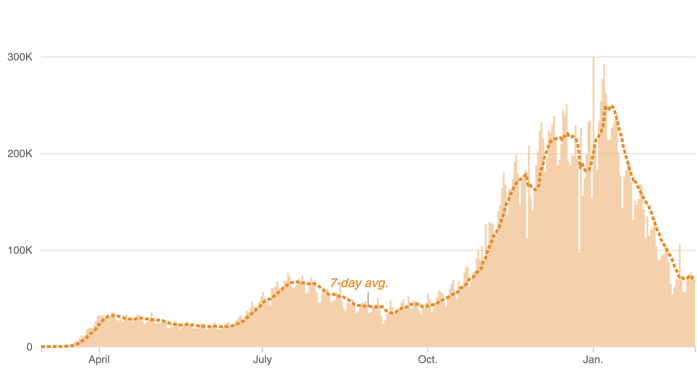
 More than 28 million people in the U.S. have had confirmed coronavirus infections and more than 513,000 have died of COVID-19. Tens of thousands of new cases are reported daily nationwide. In the graphics below, explore the trends in your state.
View the data via a heat map (immediately below), curve charts, a table of state-by-state trends over four weeks, or a map of total cases and deaths. ...
Country / Region Tags:
Problem, Solution, SitRep, or ?:
Groups this Group Post belongs to:
- Private group -

Recent Comments