Most Maps of the New Ebola Outbreak Are Wrong
Villages, and sometimes whole regions of the Congo, are misplaced—but the ministry of health and a team of cartographers are racing to get better data.
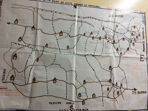
On Thursday, the World Health Organization released a map showing parts of the Democratic Republic of the Congo that are currently being affected by Ebola. The map showed four cases in Wangata, one of three “health zones” in the large city of Mbandaka. Wangata, according to the map, lies north of the main city, in a forested area on the other side of a river. That is not where Wangata is. #DRC #Ebola cases per Health Zone in Equateur province as of 15 May 2018 http://www.who.int/csr/don/17-may-2018-ebola-drc/en/ … — Peter Salama (@PeteSalama) “It’s actually here, in the middle of Mbandaka city,” says Cyrus Sinai, indicating a region about 8 miles farther south, on a screen that he shares with me over Skype. Almost all the maps of the outbreak zone that have thus far been released contain mistakes of this kind. Different health organizations all seem to use their own maps, most of which contain significant discrepancies. Things are roughly in the right place, but their exact positions can be off by miles, as can the boundaries between different regions. Sinai, a cartographer at UCLA, has been working with the Ministry of Health to improve the accuracy of the Congo’s maps, and flew over on Saturday at their request. For each health zone within the outbreak region, Sinai compiled a list of the constituent villages, plotted them using the most up-to-date sources of geographical data, and drew boundaries that include these places and no others. The maps at the top of this piece show the before (left) and after (right) images. Consider Bikoro, the health zone where the outbreak may have originated, and where most cases are found. Sinai took a list of all Bikoro’s villages, plotted them using the most up-to-date sources of geographical data, and drew a boundary that includes these places and no others. This new shape is roughly similar to the one on current maps, but with critical differences. Notably, existing maps have the village of Ikoko Impenge—one of the epicenters of the outbreak—outside the Bikoro health zone, when it actually lies within the zone. “These visualizations are important for communicating the reality on the ground to all levels of the health hierarchy, and to international partners who don’t know the country,” says Mathias Mossoko, the head of disease surveillance data in DRC. “It’s really important for the outbreak response to have real and accurate data,” adds Bernice Selo, who leads the cartographic work from the Ministry of Health’s command center in Kinshasa. “You need to know exactly where the villages are, where the health facilities are, where the transport routes and waterways are. All of this helps you understand where the outbreak is, where it’s moving, how it’s moving. You can see which villages have the highest risk.” To be clear, there’s no evidence that these problems are hampering the response to the current outbreak. It’s not like doctors are showing up in the middle of the forest, wondering why they’re in the wrong place. “Everyone on the ground knows where the health zones start and end,” says Sinai. “I don’t think this will make or break the response. But you surely want the most accurate data.” It feels unusual to not have this information readily at hand, especially in an era when digital maps are so omnipresent and so supposedly truthful. If you search for San Francisco on Google Maps, you can be pretty sure that what comes up is actually where San Francisco is. On Google Street View, you can even walk along a beach at the other end of the world. But the Congo is a massive country—a quarter the size of the United States with considerably fewer resources. Until very recently, they haven’t had the resources to get accurate geolocalized data. Instead, the boundaries of the health zones and their constituent “health areas,” as well as the position of specific villages, towns, rivers, hospitals, clinics, and other landmarks, are often based on local knowledge and hand-drawn maps. Here’s an example, which I saw when I visited the National Institute for Biomedical Research in March. It does the job, but it’s clearly not to scale. Much of the Congo is also incredibly remote, and many villages have never been included on a digital map. Some were added based on information from the last census, which was done in 1984, using data points that often weren’t actually collected on the ground. On Sinai’s screen, he shows me three white dots that are meant to represent villages in Bikoro. “I know they’re not accurate,” he says, “because they’re in the middle of a lake.” There still isn’t an accurate map showing where all the cases are coming from. “We need to see that, and to see where the contacts of the cases are,” says Ousmane Ly, a digital health advisor at the nonprofit PATH, who was seconded to the Ministry of Health in February. “This information is very important for us to see the progress of the epidemic and for the ministry and cabinet members to make decisions.” Claire Halleux, a co-founder of OpenStreetMap DRC, has been helping, too. “Apart from the few main roads and rivers, even the emergency teams don’t know about where all the roads are,” she tells me. To fix that problem, she and other volunteers have used satellite imagery to mark the positions of buildings, rivers, waterways, roads, and other landmarks, creating a blank base map. People on the ground can then use smartphones or GPS receivers to label the map with accurate names. “We have people basically mapping the area all day long,” Halleux says. “If you were looking at this area two weeks ago, you’d have found very little data. Since then, more than 300,000 objects have been added.” This afternoon, Selo is leading an emergency meeting of the Référentiel Géographique Commun—a working group of everyone in the DRC who uses geospatial data. Their goal is to “all agree on a standardized set of data that everyone uses,” she tells me. Better maps should then be available to everyone working on the outbreak, but “these won’t be the final boundaries,” Selo says. “They’re not static. There will always be improvements as more data comes in and more validation is done.” Sinai’s work isn’t confined to the current outbreak. When I met him in the Congo in March, he was three years into an effort to map several provinces, including Kwango, which is south of the current Ebola outbreak, and east of the capital of Kinshasa. He pulled up satellite images of villages and other settlements, which had been identified using machine-learning tools, and met with health-zone officials to label these correctly. “It’s mapping local knowledge onto digital reality,” he told me at the time. In the office of Pierre Mwela Mangezi, the province’s medical director, Sinai presented his latest digital map, holding it up next to an older, rougher version that was hanging on the wall, and a simpler, hand-drawn one that was pinned to the door. “I’m going to need a bigger wall,” Mangezi joked. The differences between the maps are subtle, but crucial. For example, some health areas that shared a border on the old maps no longer do on the new ones. “It’s very important,” Mangezi said. “This is the first time that we’ve had a map of all the health areas in the province. Every 3 weeks, we send people out to health centers, and the maps help with that. Sometimes when we do vaccinations, we forget certain villages, and the maps will help us remember.” Using the maps, Sinai and his colleagues are also doing a microcensus of the region, to predict how many people live in each settlement and so estimate the total population. That project, funded by the Bill and Melinda Gates Foundation, is especially important because the Congo hasn’t done a formal census since 1984. All population figures since then are estimates, based on a 3 percent growth rate—and errors can make health work more difficult. “Let’s say you have a village with 500 kids, and your estimate is that there are 100,” Sinai explained. “Someone could go and say: I vaccinated 100 people so I got 100 percent of them—and they didn’t. Alternatively, if you think there are 400 kids and there are actually just 200, half your doses are wasted, and the records will say that coverage is at just 50 percent.” To get better estimates, teams of Congolese surveyors traveled to over 500 randomly selected sites around Kinshasa and its neighboring provinces, and did population counts for each building. To do so, they often had to trudge through thick forests and wade across rivers. They were guided only by handheld tablets, following blue dots in otherwise featureless green terrain. “There’s a face and a story behind every data point,” Sinai said. “When I saw the data, I was like: How did these guys get there?” At the back of a shaded restaurant, in the town of Kenge, Sinai greeted a team of six surveyors, most of whom he hadn’t seen for over a year. After the hugs and handshakes, he opened his laptop to show them the results of their efforts. He zoomed in on a cluster of white dots, each one a village. “These are the first time that any of these have been placed on a map, to our knowledge,” he said. A man named Mitterand pointed out two locations that seemed 20 kilometers apart, but actually involved a 70-kilometer round trip, the last third of which he did on foot. Many of the others expressed surprise that many places were more isolated than even they expected, and had little access to even rudimentary healthcare. Some hoped that health workers could now more easily find these remote settlements. They felt proud that they had literally put these places on the map. “You can make it real,” said Susa, one of the surveyors.


Comments
Re: Most Maps of the New Ebola Outbreak Are Wrong
A link to this article has been included within the Ebola information resources.
http://resiliencesystem.org/information-resources-ebola-outbreak-declared-democratic-republic-congo-may-8-2018